ShopDreamUp AI ArtDreamUp
Deviation Actions


Description
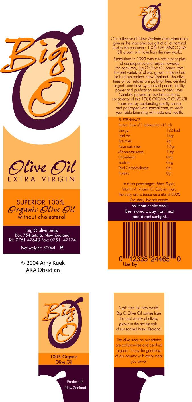
This is the front, back and neck label set for 'The Big O' olive oil bottle. 'The Big O' is a fictional New Zealand-based company that wishes to sell their products overseas. As part of the brief, all Mediterranean themes are to be avoided; this is a New Zealand product after all.
I decided to use two spot colours for the main labels (three for the additional flavours of Olive Oil - coming soon) instead of process colours, as the colours come out stronger and brighter, and production is cheaper. Orange is a colour I am not accustomed to using, and felt it was time to try it - it turned out better than I anticipated - and since 'olive green' is a cliche colour for olive oil, I went for an 'eggplant' colour to compliment the orange. After all, olives come in purple too.
It had been suggested several times that I use an olive green in the centre of the logo instead of pale orange, but in both a pale tint and full opacity, it honestly looked like rat shit. In the pale tint it reminded me of Signature Range guacamole (it's pasty-green and tastes like soap), and in full tint...well, I don't even know WHAT it looked like. Needless to say no one suggested it again.
The swing-tag around the neck has a die-cut that's a reflection of the top of the logo for added interest; the die-cut also echoes the theme of the cut out front label.
Overall I'm pleased with the result, and it earned me a B+ (note: an A is 91%). This is the revised edition without stupid errors in it, though I doubt fixing those would earn more than the said B+.
Image size
674x1411px 228.42 KB
© 2004 - 2024 Obsidian-Design
Comments5
Join the community to add your comment. Already a deviant? Log In
hi man..i'm from greece..country and producer of olive oil.I would like to c this packaging with another mix of colors..your idea is very good,but it would be better if u changed the color match..but ok..every designer has his thoughts..every client too,has different thoughts.i'm creating an olive oil label right now..and i have a strange and weird client..sometimes u cant create what you want because your client doesnt want to look forward to it...but ok..we r doing well.peace!